- Home
- Color Theory for Knitting and Crocheting
Unlocking Secrets of Color Theory for Knitting and Crocheting Projects
by Janice Jones
As a passionate knitter or crocheter, you know that yarn is not just a material to create your projects. It's a form of art, and as with any form of art, color plays a crucial role in the result. Whether you're creating a scarf, a shawl, or a sweater, using the right colors can take your project to the next level and make it truly stunning.
In this article, I'll introduce you to the world of color theory and show you how to use it to create beautiful knitting and crocheting projects.
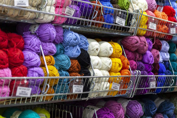
Color theory is often a full semester class in college-level fine art classes, so there is a lot of information on it available. For the purposes of this article, however, I will just touch on the different ways crocheters and knitters.
Color Theory for Knitting and Crocheting: Understanding the Color Wheel
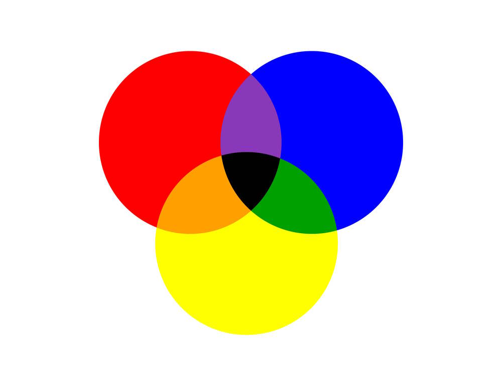
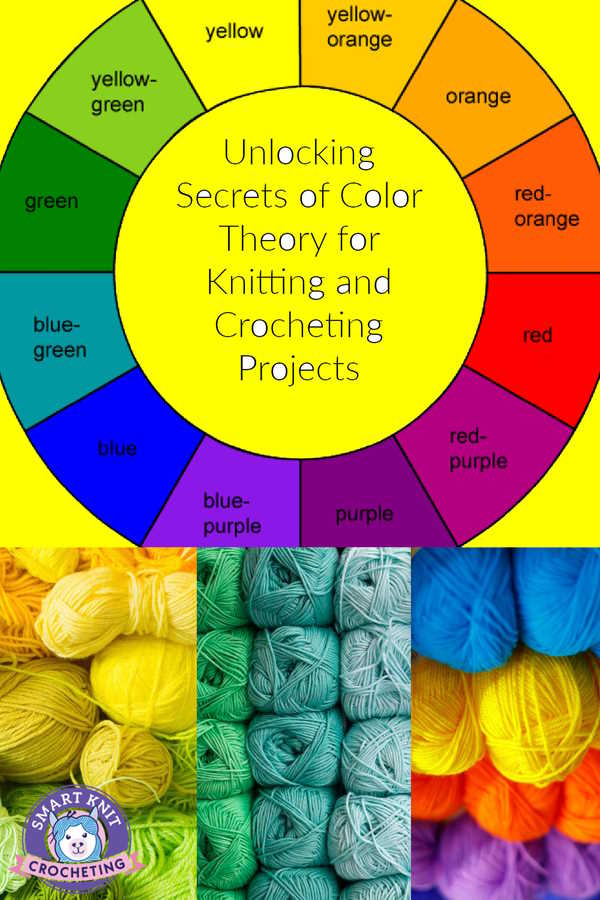
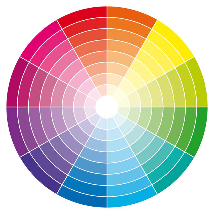
The basics of color theory begin with the color wheel. The color wheel visually represents all the existing colors arranged in a circular shape.
There are three primary colors: red, blue, and yellow. These colors are called "primary" because they cannot be created by mixing other colors.
Secondary colors are created by mixing two primary colors: orange (red and yellow), green (blue and yellow), and purple (red and blue).
Tertiary colors are created by mixing a primary color with a secondary color. For example, red-orange is a tertiary color created by mixing red (a primary color) with orange (a secondary color).
We can thank Isaac Newton, who was the first to establish a theory of color based on a color wheel. Newton used a prism to split white light into a spectrum of colors which led to the creation of the color wheel.
Warm and Cool Colors and Their Effects on Your Projects
Colors can be divided into two categories: warm and cool. Warm colors include red, orange, and yellow, while cool colors include blue, green, and purple. Warm colors are associated with energy, passion, and excitement.
They can make your project feel more vibrant and alive. Cool colors, on the other hand, are associated with calmness, tranquility, and relaxation. They can make your project feel more peaceful and serene.
Everyone has a preference, but our preferences can change depending on our mood and what we are creating.
When choosing colors for your project, consider the mood you want to convey. If you create a cozy winter scarf, warm colors like red and orange can make it more inviting. Cool colors like blue and green can make it more refreshing if you create a summer shawl.
Color Theory for Knitting and Crocheting: More on the Meaning of Color
As I mentioned above, each color has a different effect on people. It's generally assumed that red carries power, passion, and energy.
Orange, another warm color, can convey joy and enthusiasm. Yellow is also considered a warm color and projects a feeling of happiness and intellect.
We start moving into cooler colors with green, blue, and purple. Green is associated with growth, ambition, and wealth. Blue will feel tranquil, confident, and peaceful.
Purple is the color of luxury and creativity. We often do not think about black and white when used in projects but these colors call add a dark value or a simple way to add light.
What are the different types of color schemes?
There are seven major color schemes you can use when knitting or crocheting.
1. monochromatic
2. analogous
3. complementary
4. split complementary
5. triadic
6. square
7. rectangle (or tetradic)
Monochromatic Color Schemes
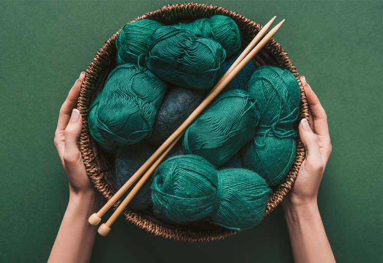
A Monochromatic is a color scheme based on only one color. It uses variations of a single hue colors and is created by adding black or white to darken or lighten the base color.
Variegated yarn balls are one example of this. A monochromatic color palette can be used successfully in projects involving household items such as pillow covers, table runners, towels, and blankets. Its subtle colors allow other objects to be placed as accent colors.
Analogous Colors
Analogous color combinations are next to each other on the color wheel. For example, red, orange, and yellow are analogous colors like blue, green, and yellow. When used together, analogous colors create a harmonious and cohesive look.
When using analogous colors, it's important to create contrast using different shades and tones of the same color. For example, if you're using blue, green, and yellow, you could use sky blue, dark green, and bright yellow to create interest and depth.
Complementary Colors and How to Use Them
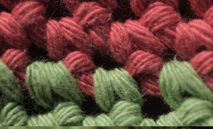
Complementary colors are colors that are opposite each other on the color wheel. For example, red and green are complementary colors: blue and orange, and yellow and purple. Complementary colors create a strong contrast that can make your project stand out when used together.
When using complementary colors, it's important to use them in the right proportion. Using too much of one color can overwhelm the other and make your project look unbalanced.
A good rule of thumb is to use one color as the dominant color and the other as an accent. For example, if you're creating a hat with red and green, you could use red as the main color and green as a trim.
What is a Split Complementary Color scheme?
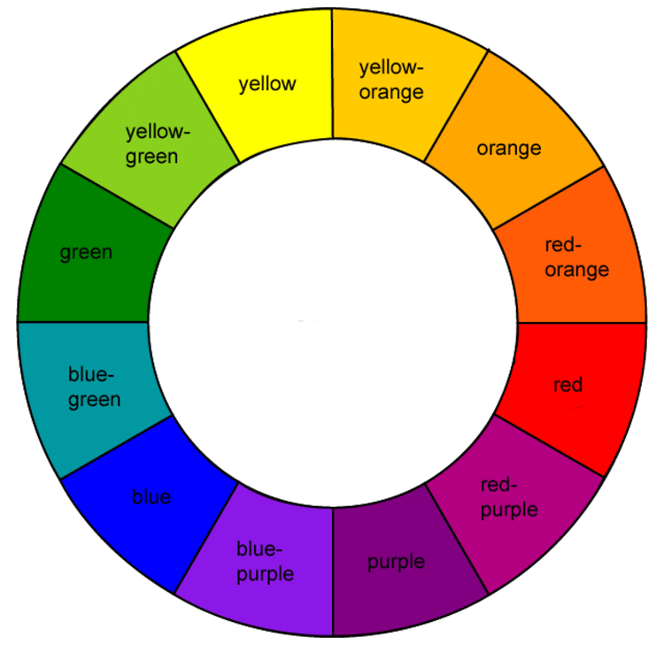
The split complementary color scheme involves three colors. One color is chosen first, and then two more colors are selected from either side of its complementary color.
For example, based on the labeled color wheel above, blue would be paired with yellow orange and red orange.
This group of yarn colors works well in home decor and is even used in web design. For example, if you start with Yellow-green, the other two colors would be red and purple, all of which have similar value.
Triadic Colors and How to Use Them
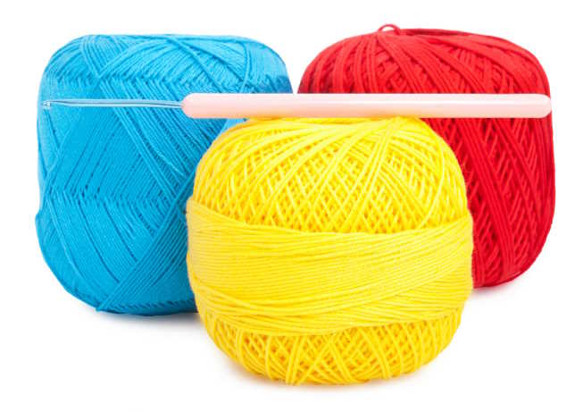
Triadic colors are colors that are evenly spaced around the color wheel. For example, red, yellow, and blue are triadic colors like orange, green, and purple. Triadic colors create a bold and vibrant look when used together.
When using triadic colors, it's important to use one color as the dominant color and the other two as accents. For example, if you're using red, yellow, and blue, you could use red as the main color and yellow and blue as accents.
This type of pattern is often seen in a crocheted colorwork motif.
Square Color Scheme
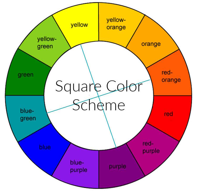
Starting with one color, the other three colors are found equidistant from each other on the color wheel. This creates a square or diamond shape and provides high contrast to your design. An example of these colorwork patterns includes red, blue, green, and orange.
What is the Rectangle or Tetradic color scheme?
The Tetradic or “rectangle” color scheme uses four colors arranged into two complimentary colors. This color family offers a lot of possibilities, but it is best if one color is chosen as dominant.
As an example, blue-green color selection is created with red-orange, yellow-green, and red-violet, creating color relationships that include both warm and color colors.
Color Theory for Knitting and Crocheting: A Primmer on Color Terms
To understand the full visible color spectrum, it's important to review a few basic definitions:
Hue
The terms color and hue are often used interchangeably by artists, designers, and in the field of fiber arts. However, they mean different things. “color” refers to all colors, including black, white, and gray.
In contrast, “hue” refers to the origin of the color we see, such as red, blue, or yellow. It is the base of the color and is always one of the six primary and secondary colors on the color wheel.
Tint
A tint is a lighter version of a given hue. It is a hue with only white added to it, not a second color. A tint can range from a hue barely lighter than the original to almost white with a tiny amount of color in it. Sometimes a tint can seem brighter than the original hue, but it is paler.
Shade
This is the opposite of a tint. A shade is a hue with only black added to it. It can include varying amounts of black; the resulting color may be barely darker than the original hue or almost black. An easy way to remember this one is to think of how the grass in the shade of a tree seems darker than the grass in the sun.
Tone
This is very similar to tint and shade, but instead of being a hue with white or black added to it, it is a hue with only gray added.
The gray added to make a tone must only consist of black and white, no other colors (many colors that are considered gray have a base that is a hue). Toned colors tend to be viewed as more sophisticated than pure hues.
Using Color Theory for Knitting and Crocheting for Choosing Yarn
Consider the color theory principles we've discussed when choosing yarn for your project. Think about the mood you want to convey and the colors that will create that mood. Consider the color of the garment you'll be wearing with your project and choose colors that complement or contrast it.
Using Color Theory For Knitting and Crocheting: Create Patterns
Color theory can also be used to create interesting and unique patterns in your projects. Experiment with different color combinations and see how they interact with each other.
Use color to create depth and interest in your patterns and consider the mood you want to convey with each pattern.
Tips for Using Color Theory For Knitting and Crocheting: Effectively in Your Projects
Here are some additional tips for using color theory effectively in your knitting and crocheting projects:
- Start small: If you're new to color theory, start with small projects like hats or scarves. Experiment with different color combinations and see how they work together.
- Use a color wheel: Keep a color wheel handy to help you choose colors that work well together.
- Consider the background: Consider the color of the garment you'll wear with your project and choose colors that complement or contrast it.
- Don't be afraid to experiment. Color theory is all about experimentation. Don't be afraid to try new things and see what works.
Conclusion
Color theory is a powerful tool for knitters and crocheters. By understanding the principles of color theory and using them effectively in your next project, you can create stunning and unique pieces that are truly works of art.
Whether you're using complementary colors to create contrast or analogous colors to create harmony, color theory can take your knitting and crocheting to the next level.
Remember, though, that any colorwork project you select, whether it be a crochet or knitting project, should be based on your personal taste, and your favorite colors are always the best choice. So go forth, experiment, and have fun with color!
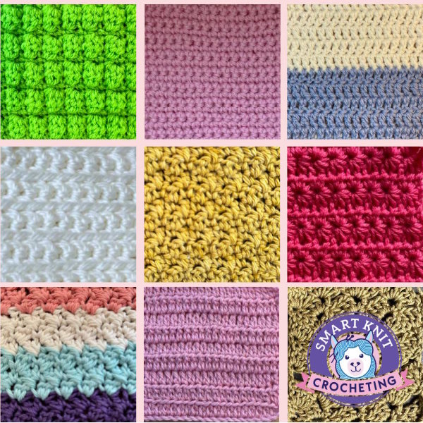
Here are seven examples of colorwork knitting.
Pin and Save for Future Reference
and, please, don't forget to share.
